CHURCH RE-BRAND OF LOGO/ WEBSITE
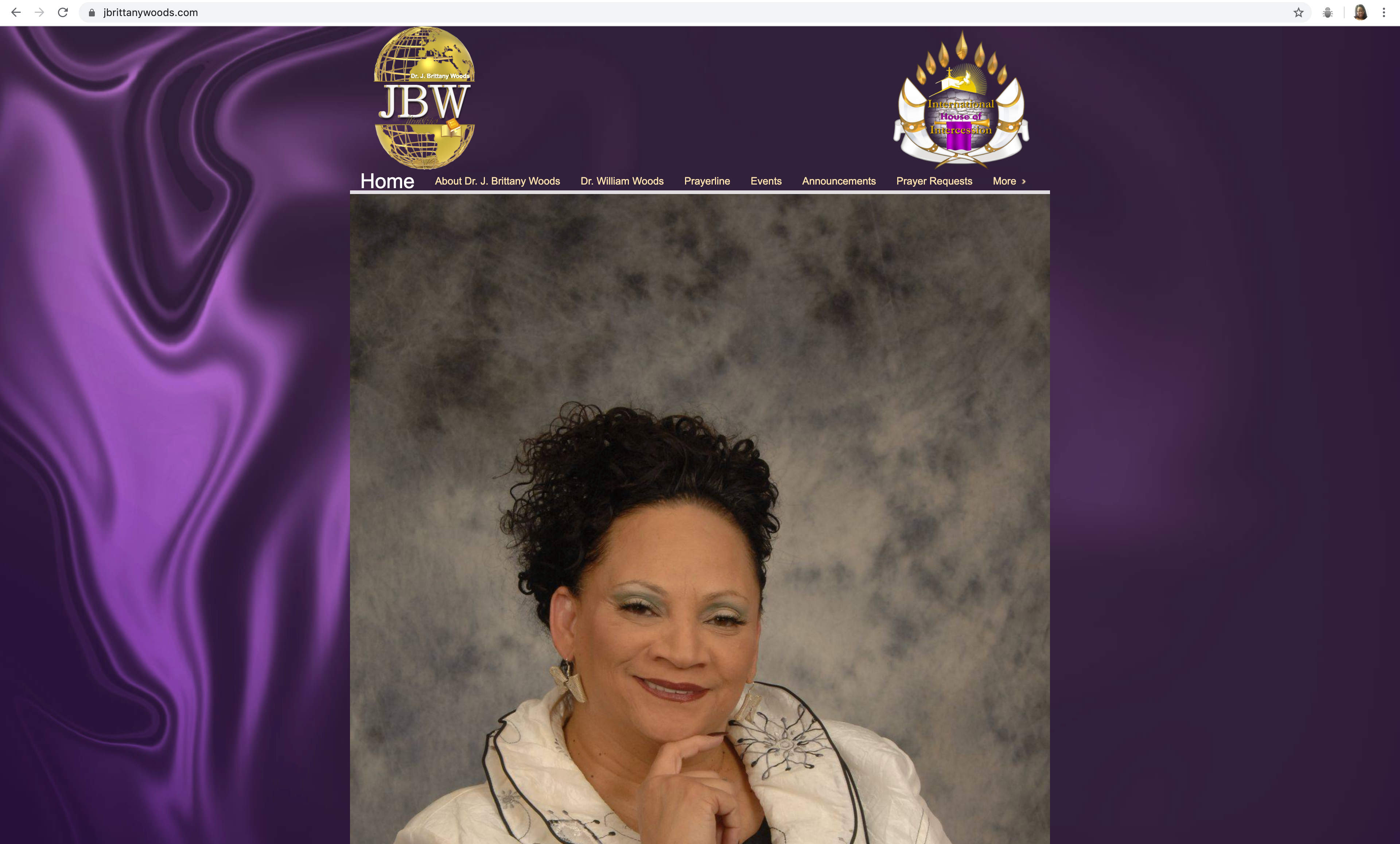
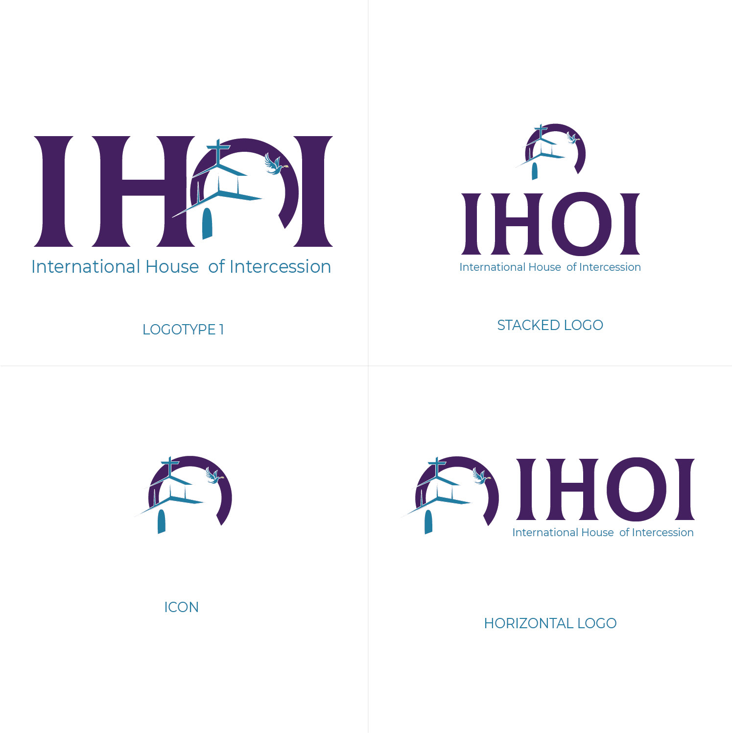
I was asked to re-brand a church organization. The church wanted their site to be updated and eye-catching. They wanted the site to not only grab a younger generation attention but keep the attention of their older members. They also wanted their logo to be rebranded so that they can have a versatile logo to fit on products/apparel so that items can be sold to help towards obtaining a new building. They wanted to keep the purple color because it had a specific meaning but they were open to the idea of adding additional color. Below is the current site for the church and logo.


RE-BRANDING PROCESS
I clicked through and viewed the pages of the current website. I then took some notes of the things I notice that could be changed and proceeded with a conversation with my client. The pastor express her wants and needs and the vision she had. She wanted a site that was easy to follow, family oriented, and appealing to the eye. The logo she wanted something a little simple but still eye catching.
LOGO DESIGN

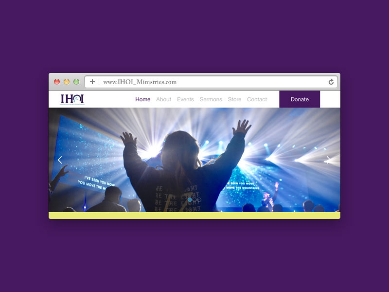
WEBSITE WIRE-FRAME

WEBSITE COMP/ COLOR CHOICE 1


Merchandise
