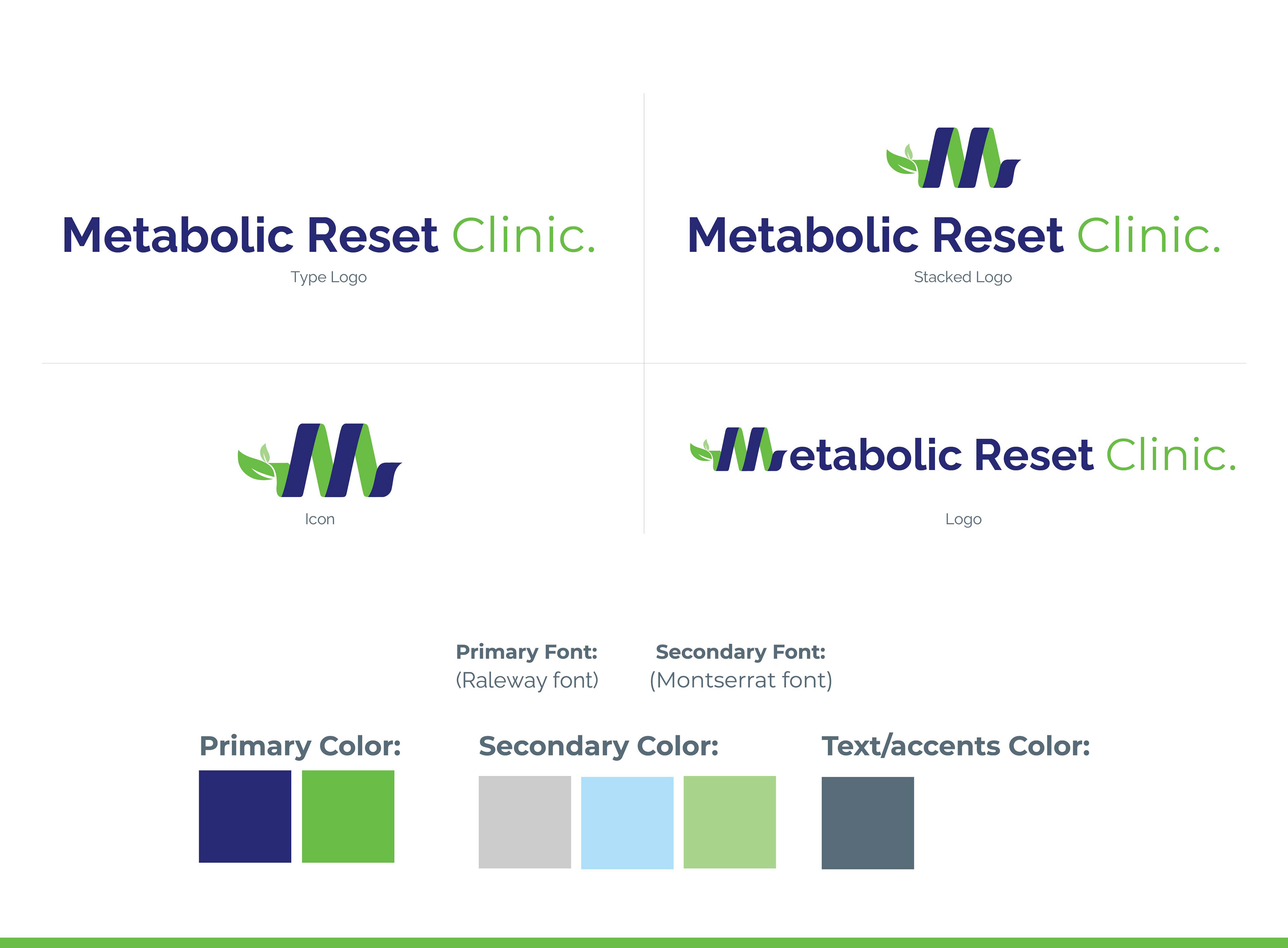
Logo/ Branding
My design method begins by reducing crucial brand characteristics into a visually appealing concept—the Metabolic Spiral, which represents transformation, growth, and the ongoing cycle of metabolism. I apply a meaningful color palette of deep blue and brilliant green, expressing trust, reliability, wellbeing, growth, and rebirth, using a sleek and modern design approach. The spiral represents the client's journey. The font for "Metabolic Reset Clinic" was chosen because it is modern, professional, and legible. A recognizable feature, such as a stylized leaf, was added to symbolize health. The logo is intended to be adaptable, expandable for different sizes, and appropriate with a wide range of marketing materials, evoking feelings of trust, growth, and rejuvenation in line with the clinic's objective.